My sister and I enjoy living in cities, mainly because they offer access to dainty things like coffeeshops, bookstores, subways, cupcakes, "eyes on the street", and so on. Also salient is the fact that they offer jobs - or used to? - but that's really just a funding vehicle for the coffee/books/pastries/etc. Sadly, the urban arena brings with it a host of colorful dangers, "city dangers" if you will. These dirty, scary, itchy, annoying, painful challenges are what our blog is about!
But, before there were words, there were pictures, and where there are pictures, there are people to tell you why the pictures you made are bad. Those people are designers and my sister is one! So I solicited her advice on design back when our blog was still in the womb.
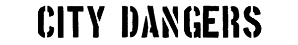
AMY - I am trying to make a logo for our sibling-blog/future-book "City Dangers", and these are some of the fonts i was looking at, followed by what they imply to potential readers. Let me know what you think and if you have any other ideas!
 “you may get lassoed, to death.”
“you may get shot by a robot, in space!”

“TRON may run you over with his cyber-bike.”

“you may get killed by a comic book villain”

“Beware of ebola/AIDS, and also traffic?.”

“Beware of hidden treasure maps and/or over-taxed colonists”
Or, of course, we could go with Helvetica Neue, which says what? like, “you may die of boredom in a trendy nightclub” or “you may die of eating cheerios in a LEED certified building.”
I think you missed your calling, bro.
ReplyDeleteI saw your logo and totally thought, Oh! this blog seems like a good tool to help keep me aware of the danger of ebola & aids... glad to see that the proper research went into your logo! I'll look forward to keeping up with the Peters :)
ReplyDeletehahahaha. i guess i missed the part where it was established that all fonts are fortune cookies.
ReplyDeleteps - welcome to our blogroll